white space, precise type, one quiet red signal. the working library for the apps beside your work.
00 · family audit · 2026-10-03
one family. different jobs.
Shared components and product-specific surfaces are recorded separately. A matching character does not prove that controls or runtime behavior use the same system.
The native suite shares N1 color, type and shell components. Aside adapts them to a browser. Krest now uses the N1 native shell with current state and snapshot history. Shaper Pulse is shown as an independent experiment.
Current source: N1 semantic roles and generated web / Swift adapters. DTCG 2025.10 offers typed JSON, aliases and theme resolution. A future adapter must preserve existing values and pass light / dark parity checks before adoption.
a short source edge, time and text carry meaning. the period stays visible during detail.
03 · states
say exactly what is known.
evidence receipt
calendar context
inline context · no background popup
eventkit cannot establish remote sync health or offline state.
pressure + hint lifecycle
hint: suppressed
example history
no recorded interaction.
03.1 · hint card
one card for every notice. two products, one component.
contract (rule 30): live mark 40 pt on the left · title 11 px 600 · one line of fact 11 px muted, ellipsis · up to three buttons 28 pt with 8 pt corners · frame 1 px hint-border, hint-radius 16 · width 320 pt. the specimen above is synthetic and says so.
appear (rule 28): alpha 0 → 1 with a 6 pt rise over motion-window-appear 180 ms; the mark assembles 700 ms after the first frame. reduce motion shows the card at once with a static mark.
leave (rule 29): any button, escape or auto-hide after the product timeout (MEM PRISM 12 s, Calendar Control 45 s); one card per occurrence, snooze and dismiss remembered by occurrence id. the card never activates the app and never moves the cursor.
native:AIMHintCard.swift(AppKit only, hashed in the receipt):init(title:fact:actions:mark:onDismiss:autoHide:width:) · appear() · dismiss(reason:) · makePanel(for:) + present(in:at:)with orderFrontRegardless(), no activate.
products: MEM PRISM 0.6.0 pressure hint (inspect · 30m · dismiss); Calendar Control 1.0.0 upcoming event N minutes before (1–120, default 5): join or open day · snooze N · dismiss, inside the window, as a macOS notification and as a floating card by the menu bar. checked on the testbed through axdrive capture, never with a real cursor.
04 · pin
one word, one behaviour.
the pin button
MEM PRISM0.6.0
panel body · 760 × 700
1 · 2 · 3 keysesc close0.6.0
three other names
float· a window stays above other windows; Calendar Control keeps it in the bottom line next to detach.
pin tab· the browser keeps a tab open (Aside Tweaks ⇧⌘D).
bookmark· a page is saved to a list (Aside Tweaks ⌘D, added at the end).
the ◉ / ○ glyph and the pin-panel identifier belong to the first meaning alone.
header order
right edge, always this order:
version·settings·pin·×
the tab strip carries views only. a product without one of the four leaves the slot empty and keeps the order. MEM PRISM kept pin in the second row, Language Relay in the header, Calendar Control in the tab row: one order now.
rule 31: pin means one thing, the surface survives an outside click. one component AIMPinButton, ◉ / ○ 28 pt, identifier pin-panel, tooltip from the panel policy, off by default, stored values migrated under one key.
rule 33: escape, command-w, ×, the menu bar item, the hotkey and the cli route reach one close(reason:) with one leave transition; the reason travels into the receipt. a second exit with different consequences is removed in the wave it is found.
a non-activating panel learns about the outside click through a read-only global monitor (NSEvent.addGlobalMonitorForEvents, leftMouseDown / rightMouseDown); nothing is sent and the cursor is never moved.
04.1 · surfaces
four kinds of surface, one behaviour each.
menu bar panel
NSPopover, transient by default, appear motion-panel-appear 200 ms, pin applies, closes on an outside click, esc, ×, the bar item.
MEM PRISM · Language Relay · Calendar Control 1.0.0
window
framed or borderless, appear motion-window-appear 180 ms with a 6 pt rise, geometry remembered, float applies, system buttons or × 28 pt.
Calendar Control detach · about
hint card
AIMHintCard in a non-activating panel, one card per occurrence, auto-hide by the product timeout, leaves on any action (rule 30).
MEM PRISM 0.6.0 · Calendar Control 1.0.0
browser surfaces
sidebar, command palette ⇧⌘K, extension popup, page overlay. inside the palette ⌘K opens the action panel of the selected row. palette rows use AIMRowCell, closing follows rule 33, browser chrome stays the browser's.
a new shared component enters at L1 or L2, gets a hash in aim-mini-apps.receipt.json and a tile here before a product uses it. a product that rebuilds a header, a hint line, a pin or an appearance of its own is off contract.
rows (rule 35): AIMRowCell = mark or avatar 16 pt · title in one line · subtitle muted 11 px · the reason the row is here on the right (match, freshness, source). a site or a person gets a 16 pt square with the first letter in Plex 500 on the wash surface; nothing is fetched from the network.
keys (rule 37): one key means the same thing across the family, the map is printed in the bottom line and in the palette. every control has a consequence (rule 38): a button, a toggle or a key changes an observable state and records its default, or it leaves the surface in the same wave.
04.2 · the shell
a product declares, the shell draws.
AIMAppHeader
mark 40 pt, name, optional state line, then version · settings · pin · × on the right edge (rule 32). controls 28 pt, inset 16, gap 8.
.aim-shell-head
AIMPinButton · AIMTabStrip
one pin glyph ◉ / ○ with identifier pin-panel, off by default; the tab strip carries views only, numbered 1…N with the matching keys and one red mark on the active view.
.aim-shell-pin · .aim-shell-tabs
AIMFooterLine
three parts on one row: keys · esc close · version and state, 11 px Plex 500 muted. the left part truncates first, the middle never shrinks.
.aim-shell-foot · AIMHintLine
AIMAppMarkView · AIMSurface
one drawing for the menu bar at 18 pt template and the header at 40 pt with the signal; the surface owns show, the appear token, the read-only outside-click monitor and close(reason:).
aim-app-mark.js · AIMAppShell.swift
every block above is rendered live, with its token and its component, in sections 09–16 of this page:product shell ↓
05 · motion
every movement has a cause.
system reduced-motion preference is respected.
06 · marks
one square. one idea. four strokes at most.
square 38 in a 48 grid · rx 8 · 2 px currentColor stroke, no fill · red signal 6 × 4 on the top edge, right
one glyph = one idea = at most four strokes, drawn with the same 2 px stroke.
the signal never moves: x=32 y=5, always #db303d, never a second red.
marks are refined, never redrawn: stroke cleanliness, equal optical mass, one signal position.
isometry fromVoxelView.swift: (x−y)·u, (x+y)·0.48·u − z·u. three faces: light top, ink left, mid right. tiles of #e8e9ed as shadow.
restored silhouettes: dense bodies, at most 200 voxels in 12 × 12 × 12, mostly light and mid, ink where the cube turns away. exactly one red signal (eye, tip, cursor, core, today).
one gesture per character, ≤ 600 ms, declared in the model: family blinks (eye → light for a frame), relay swaps its arrows, aside steps the cursor to the next row, prism flashes the red core, calendar moves today to the next day.
timing: assemble 700 ms in 6–8 depth steps (x + y + z, cubic-out); click = scatter 250 ms + assemble 550 ms + gesture; hover = 2 px lift in 160 ms. the first frame is always the finished figure; the run starts on the next animation frame. nothing loops; reduced motion keeps the gesture alone.
the character lives inside the app and answers the hand.
hover: the figure lifts 2 px in 160 ms with a ±2 px depth parallax (x + y), the isometry never rotates; the cursor leaving resets the frame.
click, Enter or Space: scatter 250 ms → assemble 550 ms → the character's gesture (flash, mirror or cycle, ≤ 600 ms). mirror and cycle change the model and stay until the next click; a model without a gesture moves its red voxel to a neighbour cell.
prefers-reduced-motion: no lift, no flight; the click plays the gesture alone. the container is role=img with the character name, tabindex 0, cursor pointer.
web:AIMVoxel.render(el, model, {interactive: true})or thedata-interactiveattribute;AIMVoxel.mark(model, {size, mono})gives the 16 / 18 / 22 / 32 px icon, mono for template menu icons.
native:AIMVoxelView.swift + AIMVoxelModels.swift(generated from the models, source hash inside). same projection and the same motion numbers (AIMVoxelMotion 0.7 / 0.25 + 0.55 / 0.16), the same gesture spec (AIMVoxelGesture), NSTrackingArea hover, click → scatter/assemble → gesture on a 1/16 s timer while the window is visible; the final frame is drawn first and the assemble starts in viewDidMoveToWindow once the window is on screen; reduce motion → gesture only; image(model:size:18, mono:true) for the menu bar. vendored byte for byte, hashed in the receipt.
08 · contract
shared source. explicit adoption.
primitives resolve into profile semantics, then component aliases. json, css and swift exports share one source digest and are checked for drift. native apps map the values into their own namespace and keep macos window behaviour.
ibm plex mono 400 / 500 / 600, latin + cyrillic, bundled locally · ofl license · Aa Бб 0123 · publishing this gallery does not establish adoption in any native app.
one source, assets/aim-app-marks.svg. build-marks.mjs turns it into AIMAppMarks.swift with the source digest inside, aim-app-mark.js injects the same symbols into a page. the header draws the mark at 40 pt with the red signal; the menu bar draws it at 18 pt as a template image, where mono drops the signal and the system paints the rest.
10 · header
mark, name, state, then version · settings · pin · ×
the right edge keeps one order in every product (rule 32); a product without one of the four leaves the slot empty. the controls are 28 pt, the inset is 16, the gap is 8. this specimen is the live shell css: press the controls and read what changed under it.
MEM PRISMpanel · transient0.6.1
system · pressure, swap and the last reading, one local picture.
settings list every switch with its default (rule 41).
what changed
keys reach the specimen once it has focus: 1 · 2 · 3 switch the view, esc closes it. every close goes through one path and names its reason (rule 33).
○ transient: a click outside closes the surface. ◉ pinned: it survives the click. off by default, stored values migrate under one key.
the name follows the state
the accessibility description reads pin panel open while the panel is transient and unpin panel while it is pinned. a description frozen at one value is a defect of rule 41.
pin panel open
three words that are not pin
float keeps a window above other windows and sits in the footer line next to detach. pin tab protects a browser tab from closing. bookmark saves a page to a list. none of the three borrows the glyph or the identifier.
the strip carries views, never the state of the surface: pin, settings and close stay in the header. the tabs are numbered 1…N from the left and the same digits work as keys inside the product. a tab that opens a dialog instead of switching a view is not a tab.
three parts on one row, 11 px Plex 500, muted. the left part truncates first, the middle never shrinks, the right part carries the version and the honest state of the surface. the same line in the browser product, where esc close is the palette key line.
mark 40 pt on the left, title, one line of fact, at most three buttons 28 pt. it appears with the window token, 180 ms and a 6 pt rise, and leaves through an action, escape or the product timeout. the reason is written down once and changes nothing else.
one row shape for every list of the family: a product mark or a 16 pt letter square on the left, the title in one line, the subtitle muted, and on the right the reason the row is in front of you. no emoji, no photoreal avatar, no second accent colour, nothing fetched from the network.
the products vendor these files byte for byte and verify them against the receipt; this page loads the same files, so a drift here is visible here. · rules 39–42
four products keep one status item contract. the item is on by default and draws the product mark; a mode adds one short value beside it, drops the mark for the value alone, or takes the item off the bar after a confirmation that says how the panel is reached afterwards. the retired smart mode, which hid the item under low load, keeps its slot empty and stored settings migrate to mark + value once. pick a mode and read the strip: this is what the bar ships.
the header of a panel draws the voxel character at 40 pt and answers the hand with its one gesture; the bar draws the flat mark at 18 pt, where a voxel body reads as a block. switch the product and both sides change together: the same product, two drawings, two places.
MEM PRISMpanel · header character 40 pt
click the character: scatter 250 ms, assemble 550 ms, then its one gesture.
about shows the same character large; the favicons and the bar keep the flat drawing.
19 · global keys
one combination per product, recorded by pressing it
each product answers one global combination, the same key for open and close, editable in its settings. a combination held by another product of the family or by the system is refused with a red line and never stored. try one below and read what the settings would answer.
the field records: press it, then press the combination.
21 · theme
two profiles, one palette, one switch.
rule 1 asked for a single white palette. rule 53 replaced it on 2026-10-02: the family keeps one palette and two profiles over it, and the choice belongs to the person, not to the system setting.
white profile n1
the default. canvas white, ink #202124, dividers #e8e9ed. every product opens in it.
black profile n1-dark
canvas #202124, text gray100, dividers gray800. the palette does not change: only the semantic tokens re-point.
the control
an empty square is white, a filled square is black. in the apps it stands in the footer before the apps link, on the site in the menu before the language. one glyph in both homes.
where the choice lives
apps keep it under .theme, the site under aim.apps.theme in local storage. both survive a restart, both default to white when the store is unreadable.
what may not be written by hand
no colour literal anywhere. a surface that hardcodes a hex stays light when the profile flips, which is how the suite layer broke until 2026-10-03.
the character
the voxel in the header stands on a white plate, so the same drawing reads in both profiles without a second model.
open: the window screenshots inside the catalog cards are captured in the white profile and sit as light patches on a black page. they are re-shot per product, not by a global switch.
20 · the stand
offscreen on the owner mac, windows in the virtual machine
drivertestbed/bin/axdrive · standtestbed/vm/ · rules 27 and 52
a check on the owner machine stays offscreen, reads the surface through accessibility without showing a window, or takes an image by id of a window that is already open.
the machine takes about 25 gb of disk and 4–8 gb of memory, so it starts for the run and stops after it; a run that cannot get the memory refuses to start and says so. · testbed/vm/README.md
21 · rules
fifty-three rules. one text, three homes.
source:internal-sites/aim-product-system/AIM-APPS-RULES.md · team vault: {rule} {AIM} Mini Apps Design System – 2026-09-14 numbering is stable: the menubar wave asked for 45–47 and entered as 47–49, the quiet wave asked for 48–50 and entered as 50–52.
palette N1 only: white #ffffff, ink #202124, muted #6b6e75, line #e8e9ed, wash #f5f6f8 / #f2f3f5. one red signal #db303d; never a second red. Rule 53 reads the same roles from N1 dark: #202124, #f2f3f5, #9aa0a6, #3c4043, #2d2e31, the same red.
one face: IBM Plex Mono 400 / 500 / 600, latin + cyrillic, shipped locally. hierarchy comes from the five named sizes and weight, never from a second family.
mark frame: square 38 in a 48 grid at x5 y5, rx 8, 2 px currentColor stroke, no fill. the signal is a red 6 × 4 rectangle at x32 y5, the same place on every mark.
glyph: one idea, at most four strokes, the same 2 px stroke. a shipped mark is refined, never redrawn; a new idea gets a new symbol id.
character: a dense silhouette of the glyph, at most 200 voxels inside 12 × 12 × 12, a solid body with air only where the glyph opens, mostly light and mid with ink where the cube turns away, plus one detail and exactly one red signal (a voxel or one 2 × 2 block). cube grammar: top light, left ink, right mid, shadow tiles #e8e9ed.
projection as in VoxelView.swift: (x − y)·u, (x + y)·0.48·u − z·u, draw order x + y + z. models live in voxel-models.json; static voxel-<name>.svg are generated, never hand-edited.
motion is finite and shared: assemble 700 ms in 6–8 depth steps (x + y + z, cubic-out) once on appearance, replay or viewport entry; click = scatter 250 ms + assemble 550 ms + gesture ≤ 600 ms; hover = 2 px lift in 160 ms. the first frame is the finished figure. prefers-reduced-motion keeps the gesture alone. no idle loops, no ambient decoration.
live mark: the character lifts under the cursor and answers a click with scatter → assemble → its one gesture, declared in the model (flash, mirror or cycle): family blinks, relay swaps its arrows, aside steps the cursor, prism flashes the red core, calendar moves today. mirror and cycle stay until the next click. keyboard: tabindex 0, Enter / Space.
where the live mark lives: the app header next to the name (44–56 pt) and the menu bar (18 px, mono template image). About shows the same character large. existing .icns icons stay.
shared exports (aim-mini-apps.tokens.json, .css, AIMMiniAppTokens.swift, AIMVoxelModels.swift, AIMVoxelView.swift, aim-voxel.js, aim-i18n.js) are vendored byte for byte and verified by SHA-256 from aim-mini-apps.receipt.json. no hand edits inside a consumer.
product page = five sections in this order: hero (mark, live character, version, install button) → one example → features (3–4 tiles) → install (zip, SHA, steps) → privacy. footer: AIM mindset apps · built by alexander povaliaev.
english by default, russian through #lang-toggle (aim-i18n.js: data-en / data-ru, ?lang=ru, optional localStorage). product names MEM PRISM and Calendar Control stay untranslated. og:locale en_US, og:locale:alternate ru_RU.
versions: +1 patch per wave. a release = zip (ditto -c -k --keepParent) + SHA256SUMS + release notes; the page shows the same version, zip and SHA as the binary.
user data stays on the Mac: no account, analytics, advertising surface or cloud call. public demos use synthetic data and say so on the page.
truthful states: observation (observed / degraded / unobserved), evidence binding, request progress and freshness stay separate axes. a successful request may show 0.
focus and reach: 2 px visible outline on every control; every interactive character is keyboard reachable; role=img and aria-label name the character.
pages have no horizontal scroll at 390 px and a clean console at 1440 and 390; the design system stays under 12500 px tall at 1440 (53 rules and twelve blocks).
text: lowercase headings in the catalog voice, short dash only (U+2013, never U+2014), no antithesis of the form “not X but Y”, no padding openers before the point. One exemption, and only one: the unobserved placeholder of the contract is the em dash glyph U+2014, a reading that is missing rather than a piece of prose; it is allowed where a product renders a state and nowhere else, which covers the one copy of the glyph inside aim-mini-apps.tokens.json (evidence.zero), where it quotes the placeholder a degraded reading draws. Code comments count as text and carry the short dash.
hosting: apps.aimindset.org from ai-mindset-org/lab-sites, sites/apps/; only the coordinator pushes. no Netlify, Vercel, OpenAI Sites or other third-party hosts.
adoption is explicit: publishing the gallery proves nothing about a native app. a product records its profile, token mapping, exceptions and vendored hashes in its README and passes its own verify / Makefile check.
window header: live mark 40 pt · product name · version · on the right settings and an always visible way to close. a framed window uses the system buttons; a frameless panel shows a 28 pt × button on the right plus the esc close hint in the bottom line. the version slot carries one shape everywhere, 1.0.1 · build 61: version and build number of the same binary and nothing else. where the product runs (local + server, bridge, EventKit) belongs to the status line under the name, and the product page prints the same pair.
bottom hint line, one structure in every app: keys · esc close · version / status. 11 px Plex 500, muted.
16 pt grid: content inset 16, gaps 8 / 16, tabs left-aligned on one line with the title, buttons and tabs snapped to the grid.
window appearance: the content is rendered before the window shows, the character assembles in 700 ms, everything else is static. no empty areas or half-rendered frames on open.
window size: a product default that remembers the last geometry (Calendar today 760 × 560, week → calendar 1120 × 800 and back; MEM PRISM panel; Relay 420 × 672). secondary views live in settings and keep their keys; cross-app entry sits in the bottom line as apps ↗.
permission and release lane: a missing grant (calendar, notifications, accessibility) is a centred 420 pt card with the character, one sentence and one request access button. the signature lane stays constant across builds (identity AIM Mini Apps or documented ad-hoc) so grants survive updates; a release is one release-app.mjs pass: build → sign → zip → SHA → notes → page (RELEASE-PIPELINE.md).
testbed without screen capture: an agent checks a native app in three steps, offscreen render → accessibility tree → window image by id (testbed/bin/axdrive). windows come on screen only through the app's own --testbed route (bottom-right corner, 24 pt inset, orderFrontRegardless without activate) and leave through its hide route. synthetic clicks, System Events click at, activate and anything that moves the cursor or takes the user's focus are forbidden on the working Mac; a live GUI run with a real cursor happens only in a separate macOS VM. a missing grant returns code 3 and the check falls back to offscreen.
one appearance: content laid out before the show, then one shared transition read from the tokens. NSPopover panels (MEM PRISM, Language Relay) use the system transition animates = !reduceMotion (motion-panel-appear 200 ms); windows and hint cards (Calendar Control, AIMHintCard) fade alpha 0 → 1 over motion-window-appear 180 ms with a 6 pt rise (motion-window-appear-shift); the live mark assembles 700 ms after the first frame. apps read the numbers from AIMMiniAppTokens, never from a literal. reduce motion shows the surface at once.
one close: panels are transient by default (a click outside closes), pin is off by default and visible as a ◉/○ button with a tooltip. a non-activating panel learns about the outside click through a read-only global monitor (NSEvent.addGlobalMonitorForEvents, leftMouseDown / rightMouseDown; nothing is sent). escape, command-w, ×, the menu bar item and the hotkey close the same way; a hint card also leaves after an action or its auto-hide. existing pin settings migrate to off once, under a migration key.
hint card, one component for every notice (AIMHintCard.swift, vendored and hashed like the other exports): live mark 40 pt on the left, title, one line of fact, up to three buttons 28 pt, thin hint-border frame with hint-radius corners, appearance by rule 28, auto-hide after the product timeout or after any action, one card per occurrence, snooze and dismiss remembered by occurrence id. the card never activates the app: a non-activating panel ordered front with orderFrontRegardless(). MEM PRISM pressure hints and the Calendar Control upcoming event notice (N minutes before, 1–120, default 5; in the window, as a macOS notification, as a floating card by the menu bar) use it.
one pin: pin names one behaviour, the surface survives an outside click. One component AIMPinButton (◉ / ○, 28 pt, identifier pin-panel, tooltip from the panel policy), off by default, stored values migrated under one key. The name follows the state: the accessibility description reads pin panel open while the panel is transient and unpin panel while it is pinned; a description frozen at one value is a rule 38 defect. Holding a window above other windows is called float and sits in the bottom line beside detach; protecting a browser tab from closing is pin tab; saving a page to a list is bookmark. Those three never borrow the pin glyph or the pin identifier.
header right edge, one order: version · settings · pin · ×. The tab strip carries views only, the state of the surface stays in the header. A product missing one of the four leaves the slot empty and keeps the order.
one close: every entrance (Escape, Command-W, ×, the menu bar item, the hotkey, the CLI route) reaches a single close(reason:) with one leave transition; the reason travels into the receipt and changes nothing else. A second way out with different consequences (hide beside close, a key of its own) is removed in the wave it is found. Appearance and closing live in the shared AIMSurface (show, appear token by rule 28, outside-click monitor by rule 29, close), so three apps read one implementation.
component hierarchy, four levels. L0 tokens aim-mini-apps.tokens.json: values only, components hold no literals. L1 shared primitives: Swift AIMMiniAppTokens, AIMVoxelModels, AIMVoxelView, AIMHintCard, AIMAppMark; web aim-mini-apps.css, aim-voxel.js, aim-i18n.js. L2 shared shell components: AIMAppHeader, AIMHintLine, AIMPinButton, AIMTabStrip, AIMSurface, AIMRowCell. L3 product assembly: a product declares name, version, tabs, size and body; the header, the hint line, the pin and its own appearance are taken from L2. A new shared component enters at L1 or L2, gets a hash in aim-mini-apps.receipt.json and a gallery tile before a product uses it.
rows and avatars: a list row is one component AIMRowCell: mark or avatar 16 pt on the left, title in one line, subtitle muted 11 px, the reason the row is here on the right (match, freshness, source). Product marks come from aim-app-marks.svg; a site or a person gets a 16 pt square with the first letter in Plex 500 on the wash surface; a favicon is used only where the source already keeps it locally, nothing is fetched from the network. No emoji, no photoreal avatar, no second accent colour in a row.
four products, four surface sets. Three native apps keep window, panel and hint card. Aside Tweaks is the fourth product of the same system and its surfaces are browser ones: sidebar, command palette (⇧⌘K), extension popup, page overlay. It keeps the palette, the face, the grid, the marks, the row cell, the ranking and the close rule; window tokens (motion-window-appear, the 40 pt header mark) apply where a surface owns its frame, browser chrome elements stay the browser's.
keys: one key means the same thing across the family (Escape closes, Command-W closes, digits switch views or blocks, the palette key opens the palette). The palette key is ⌘K in the native set and ⇧⌘K in the browser set, where ⌘K belongs to the Chromium omnibox and cannot be taken; inside the Aside Tweaks palette ⌘K opens the action panel of the selected row, and that pair is printed wherever the palette key is named. The key map of a product is printed in its bottom line and in its palette. A key with two meanings inside one product, or with opposite meanings in two products, counts as a defect and is renamed in the wave it is found.
every control has a consequence: a button, a toggle or a key either changes an observable state and records its default, or it leaves the surface in the same wave. Settings list every switch with its default and the view it changes; a view that lives in settings alone keeps its key.
one mark, two sizes: the menu bar icon and the header mark are the same drawing from aim-app-marks.svg, rendered by one component (AIMAppMarkView.image(_:size:mono:) in Swift, aim-app-mark.js on the web). The bar takes 18 pt with isTemplate = true, which drops the red signal and lets the system paint the outline; the header takes 40 pt and keeps the signal. AIMAppMarks.swift is generated by build-marks.mjs and carries the sourceSHA256 of the svg, so a mark that drifts from the drawing fails the check instead of living on as a private copy of the paths. The voxel character stays an illustration inside a surface and never goes into the menu bar. page chrome may point a <use> at the sprite file directly: that is the same source, not a second drawing. every mark inside the content of a page goes through the component.
the shell is assembled from L2 components, never rebuilt per product: AIMAppHeader, AIMPinButton, AIMTabStrip, AIMFooterLine (AIMHintLine) and AIMSurface in AIMAppShell.swift, aim-app-shell.css and aim-app-mark.js on the web. A product declares name, version, state line, tabs, size and body; the header, the pin, the tab strip, the footer line, the appearance and the close come from the shell. Components read their values from the tokens and hold no literal colour, radius or duration, and the files are vendored byte for byte and hashed in aim-mini-apps.receipt.json like every other export.
a control without a consequence does not survive the wave: every button, toggle, tab and key of a product is walked on the testbed as one table, control → press → what changed (state, view, stored value, accessibility description). A row with no visible change is repaired or the control is removed before the release, and the table stays in the QA of the product. Rule 38 states the requirement; this walk is the receipt for it.
the product surface of the site repeats the shell of the product: sections 09–16 of sites/apps/design-system.html show the mark beside the menu bar icon, the header, the pin, the tabs, the footer line, the hint card and the list row, built from the same shared files, and every block names the token it reads and the component it lives in. English by default, Russian through aim-i18n.js; every control on the page changes something observable, by rule 41. A shared component without a block there is not shared yet, and the catalog links to the design system.
the system has one document: sites/apps/design-system.html carries the tokens, the atoms, the states, the shell blocks, the marks, the characters, the contract and the rules in one numbered run. A new section enters that run and gets its number there; a separate style, shell or component page is not started, and a page that used to exist stays as a one-line redirect into the matching anchor. The catalog and every footer link to the design system.
nothing happens without a press. A product never starts, stops, kills or deletes anything on a timer or on its own initiative: every action waits for an explicit press, shows what it will do before it does it (how many processes, how many megabytes, which files), and leaves a receipt with time, target and result in the journal of the product. Agent processes are never a target of an automatic action, and the protected list is visible in settings.
the mark in the bar is visible and readable. A status item shows the product mark at all times: the default bar mode draws the mark alone, and a mode that adds a number or a sentence is a preset the owner chooses, because a wide item is the first one macOS drops when the bar runs out of room. The glyph is checked at 18 pt on a light and a dark bar before it ships; a glyph whose inner strokes merge is simplified in aim-app-marks.svg and regenerated, never patched per product. MEM PRISM 0.7.1: the prism keeps the cube with its top face and drops the two inner spokes.
what a product shows and what it publishes are two lists. A surface on the machine may name hosts, paths, owners and log lines; the public page takes the name, the scheduler lane, the rhythm and the state, and nothing else. A generator that feeds a public page masks hosts and drops any row carrying a person, and the check reads the published page for the masked forms, not the promise in a docstring.
the menu bar item is one contract for four products. The item is visible by default and stays visible; how it looks is one setting inside each product, a single list: mark (the product mark alone, the default), mark + value (the mark with one short value: cpu and swap in MEM PRISM, the next call in Calendar Control, the layout in Language Relay, the tab count in Aside Tweaks), value (the value alone) and hidden (no item at all, chosen through a confirmation that names how the panel is reached afterwards). The smart mode, which hid the item under low load, is retired and keeps its slot empty; a stored smart setting migrates to mark + value once under a migration key. A click on the item opens the panel of the product, the next click closes it, the same in all four. The position survives a rebuild (NSStatusItem.autosaveName, verified per product), and the settings of each product carry a menu bar row with a live preview of the item in the chosen mode.
the character lives in the header, the flat mark lives in the bar. The header of a panel draws the voxel character of the product at 40 pt (AIMVoxelView with the product model in Swift, aim-voxel.js on the web) and answers the cursor and the click with its one gesture by rule 8. The flat drawing from aim-app-marks.svg stays the menu bar item, the About window and the favicons, where 18 pt turns a voxel body into a block. The catalog and design-system header use the family voxel at 56 px. Their favicon uses the same static export. Linked catalog marks are static navigation cues; interactive specimens keep rule 8. Product membership and preview versions come from assets/apps-catalog.json; a matching voxel alone does not mean full component adoption. The character assembles in 700 ms when the panel opens, the first frame is the finished figure, and reduced motion keeps the gesture alone.
one global combination per product, one key for open and close. Defaults: MEM PRISM ⌥⌘M, Calendar Control ⌥⌘C, Language Relay ⌥⌘L, Aside Tweaks ⌥⇧A, krest ⌥⌘X, Murmur AIM ⌥⌘U. The browser product is the one exception: Chromium refuses ⌥⌘A for an extension command (Invalid value for 'commands[…].mac'), so ⌥⇧A ships through chrome.commands and ⌥⌘A is set by hand on chrome://extensions/shortcuts. Each combination is editable in the settings of its product. A combination already taken by another product of the family or by the system is refused with a red line in the settings and is never stored. The footer line of a panel names its own combination, by rule 22. Murmur AIM held ⌃⌥⌘M up to AIM 4.
a combination is recorded by pressing it. The key field in the settings of a product is a recorder: a press on the field starts recording, the next combination that carries a modifier is stored and drawn as symbols, Escape leaves the old value in place, Delete clears the field. A combination without a modifier, one the system holds, and one already held by another product of the family are refused with one line that names the reason, and the field keeps what it had. A native app records through NSEvent.addLocalMonitorForEvents for the length of the recording and drops the monitor on the way out; the browser product listens for keydown on its settings page and, where chrome.commands refuses the write, prints the line that sends the owner to chrome://extensions/shortcuts. The list of the four canonical combinations stays beside the field as a quick pick.
a bridge flag has a lifetime, a reading and one restart. layoutPilotBusy in hammerspoon-layout-pilot.lua is cleared once it has been up longer than 5 seconds, the status reads busy-timeout and the next gesture works; every exit of layoutPilotFix and layoutPilotConvert passes through layoutPilotFinish or an explicit reset, and the path that left the flag standing after a failed conversion is covered by a test. layoutPilotStatus() returns tap, busy, secureInput, lastStatus and settings; the product prints it in the settings as bridge · <status> beside a restart bridge button and, when the tap is off or the flag is stuck at start, restarts the bridge once by itself and says so in the hint. Any product that leans on an external bridge carries the same three parts: a flag with a lifetime, a status function, one visible restart.
live runs with windows happen in the virtual machine. On the owner's Mac a check stays offscreen (self-test, --readings, unit tests), reads the surface through Accessibility without showing a window, or takes an image by id of a window that is already open. Showing a window, moving the cursor and taking focus belong to the stand in internal-sites/aim-product-system/testbed/vm/ (setup.sh, install-apps.sh, run.sh, probe.sh, README.md): a Tart clone of macos-sequoia-base run without a screen, the four builds installed inside it by their own installers, probe.sh <app> <scenario> opening the window there and returning images and a journal to the host. The machine takes about 25 GB of disk and 4–8 GB of memory, so it starts for the run and stops after it (tart stop); a run that cannot get the memory refuses to start and says so. The --testbed route, which puts a window in the corner of the owner's screen, stays for debugging on an explicit request.
One theme, white or black: AIMThemeButton (□ / ■, 28 pt, theme-toggle) right before apps in the footer line, the same switch as a settings row. White by default, stored as <bundle id>.theme = light or dark across restarts. A product applies it to its own process, never to the Mac; shell colours carry both profiles through AIMAppShellStyle.role, the open panel is rebuilt in place, the header character keeps a white plate, the menu bar mark follows macOS.
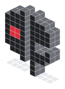
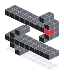 Language Relay
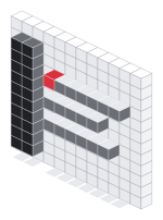 Aside Tweaks
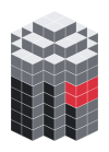 MEM PRISM
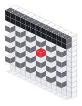 Calendar Control
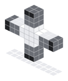 Крест
Крест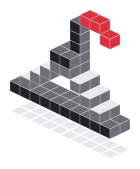 style os